制作実績
住友商事株式会社 様
所沢の憩いの場。ショッピングモール「Emi Terrace」VI・ロゴ開発
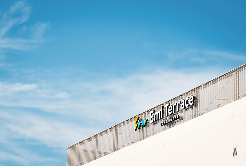
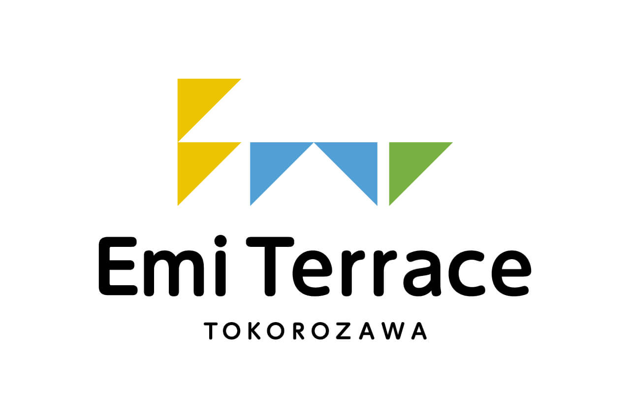
Emi Terraceロゴ
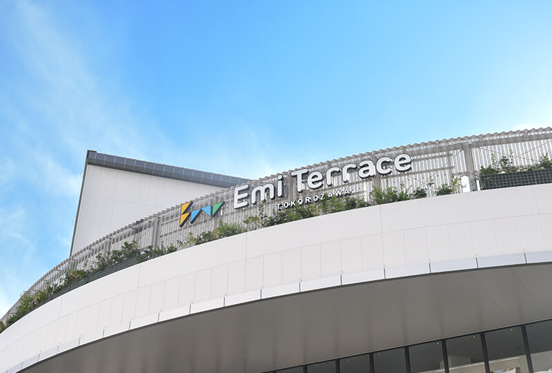
Emi Terraceロゴ
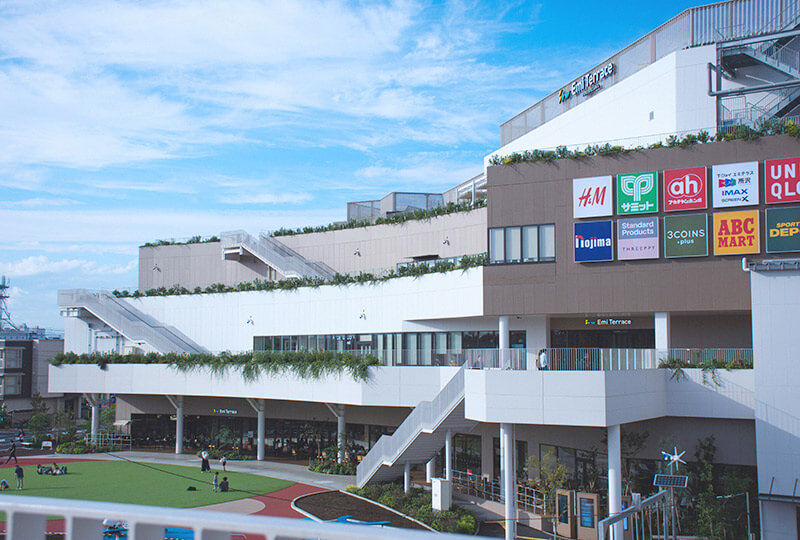
「Emi Terrace」商業施設外観
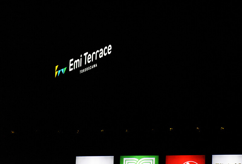
Emi Terraceロゴ 夜間の様子
制作概要
- お客さまのニーズと課題
- 2024年9月に、埼玉県所沢市にオープンした商業施設「Emi Terrace」(エミテラス)。当社では、Emi TerraceのVI・ロゴ制作を担当しました。
デザインの方向性としては、「ファミリー向けの商業施設に合うロゴにしたい」というご要望がありました。所沢には、ファミリーやハイセンスな方々も住んでいるため、そうした層をキャッチしつつ、緑あふれる都会感も演出したいようでした。
ヒアリングした内容を元に、配色や使用する書体、ロゴ自体の全体の見え方を検討し、最終的には20案近く提案をして意見をすり合わせて行きました。提案したロゴそれぞれに「所沢が持つ魅力」を意味づけしていたので、当初の課題に加えて、所沢らしさという部分でも応えていけたと思います。
- 私たちの解決策と
制作へのこだわり - 開発したVI・ロゴは、壁面に大きく使用したり、逆にパンフレットや小さな媒体でも使用することが想定されていたので、そのどちらのシュチュエーションにも耐え、また長期にわたって使用していただけるよう、オーソドックスなデザインを心がけながらも、文字詰めや文字自体の細かな調整を詰めて行きました。
また認識のずれを防ぐために提案数を増やしたり、ロゴをコピー機で大きく出力したり、逆にとても小さく出力することで、画面上だけではなく実際に見ることでよりよいデザインになるよう気をつけました。
最終的に決定した施設名は「ほほえみ」の『Emi』と、「居心地の良さ」を象徴した『Terrace』に由来していて、ロゴマークは笑顔の口のシルエット(三角)をモチーフに、テラスのテーブルでリラックスする様子と、『Emi』を形で表現しています。また人々、都市、自然をイメージしたキーカラーの3色もクライアントが気に入ってくださり、キーカラーとして施設内で度々見ることができました。
- 結果(成果や評価)
- 今回の制作ではロゴマークとロゴマニュアルを納品していて、オープン後見た限りではしっかりとマニュアルを守って運営しているように感じます。またキーカラー3色が予想以上に広告や施設の中で使用されていて、自分たちが設定したものを起点として発展していっている感覚が面白かったです。