制作実績
公益財団法人私立大学退職金財団 様
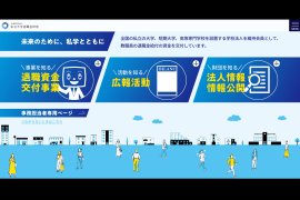
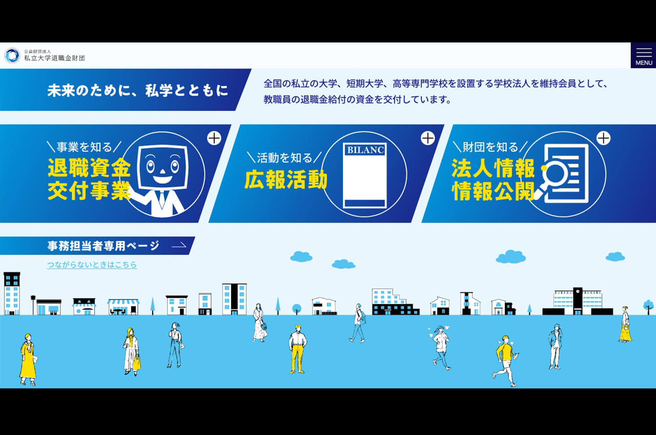
導線を重視したページ構成に。WebサイトTOPページの改修を担当
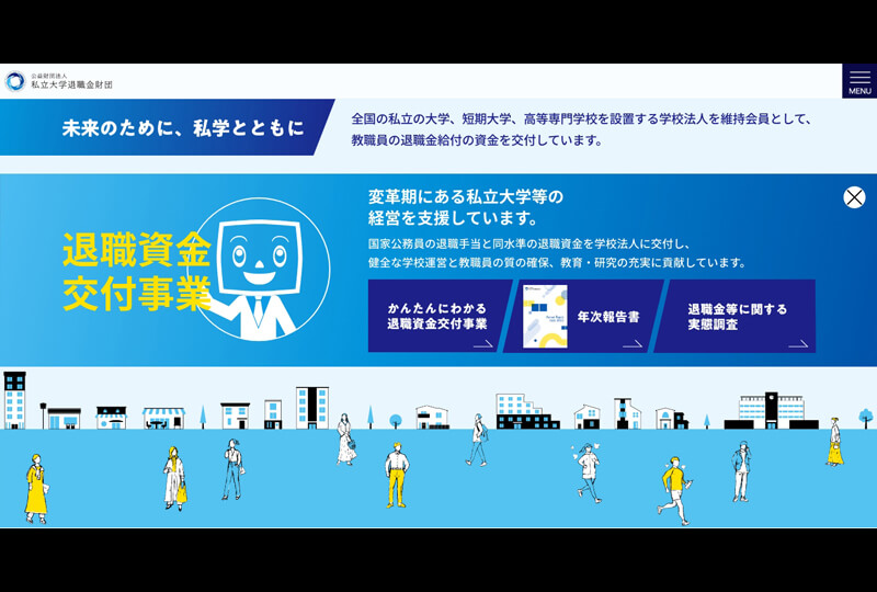
退職資金交付事業
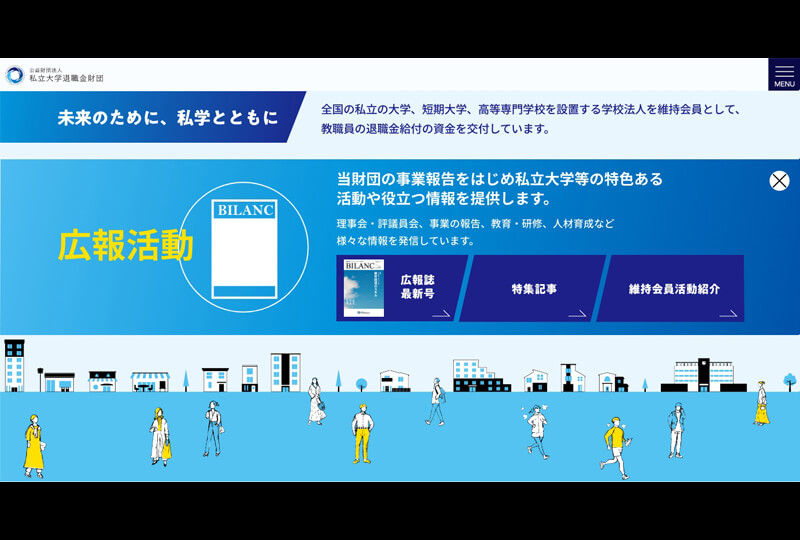
広報活動
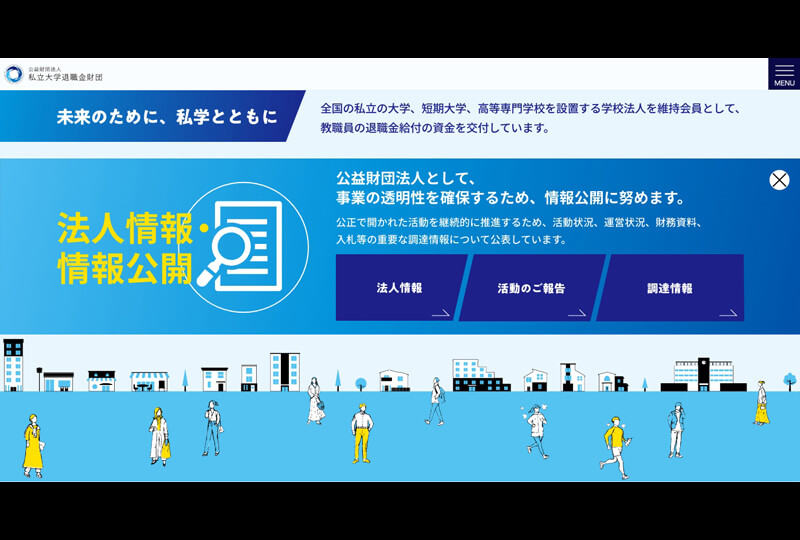
法人情報・情報公開
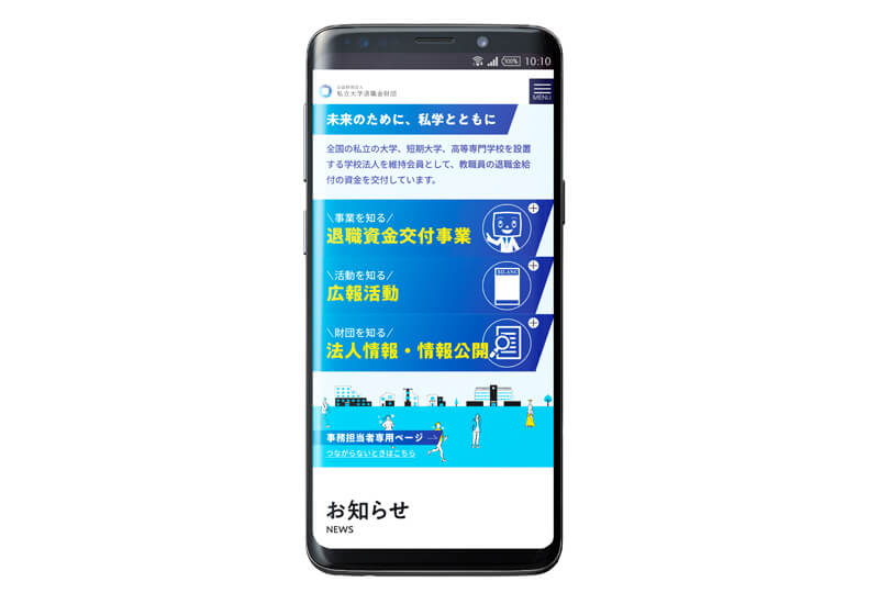
スマートフォン版
制作概要
- お客さまのニーズと課題
- 公益財団法人私立大学退職金財団様のホームページは、TOPページのファーストビューの情報量が少なく、何度かスクロールをしないと見たい情報へたどりつけないという点に課題がありました。また、基礎的な事業理解に役立つページのビュー数にもばらつきがあり、導線整理とあわせてスムーズに誘導できるよう改善したいとご相談をいただきました。
まずは最優先事項としてファーストビューにボタンを配置し、スクロールをしなくてもページへ遷移しやすい構成を提案しました。その中で、「事業を知る」「活動を知る」「財団を知る」の3つの項目で情報を整理し、優先度の高いページをまとめて案内できるような見せ方を考えました。
- 私たちの解決策と
制作へのこだわり - 今回はTOPページのみの改修依頼だったため、下層ページとのバランスを考えながらデザインを進めました。また、コーディングは先方手配だったため、参考サイトなども提示しながらサイトの動きのイメージも共有し、齟齬のないように努めました。コミュニケーションコストを意識して無駄のない進行を心がけました。
TOPページとして導線のわかりやすさを重視し、優先度の高い3つの項目はアイコンと差し色を効果的に使用。目立ちやすいデザインを意識しました。全体の背景には大学がある街並のイラストを使用し、ブルー基調で下層ページとのバランスも取れるよう考えました。
- 結果(成果や評価)
- 当初の課題は無事にクリアでき、現在まで継続してデザインをご使用いただいています。
■「公益財団法人私立大学退職金財団様」ホームページは以下よりご覧ください(外部サイトへ飛びます)
公益財団法人私立大学退職金財団